Finding a place for your Visualization: Understanding the interactions between Form and Function
Every type of data visualization, from charts to infographics, must balance form and function. Visuals that prioritize form can be stunningly beautiful but make the content more difficult to understand. Those that prioritize function can be informative, but they might be boring. Your job as a visual communicator is to find the right balance. That balance must be there, front and center, for your audience, data, and goals.
You will develop your aesthetic as you create more visualizations and read more graphs. With time, as you look carefully at others' visualizations, you will build your sense of what works and what does not. The key to successful data visualization is to practice, explore, get feedback, improve, and keep practicing. Consequently, it becomes fundamental to understand the type of visual you need to convey your data-driven message best. For starters, we can place your visual on a space divided by two perpendicular axes, Form and Function, whose intersection forms four quadrants.
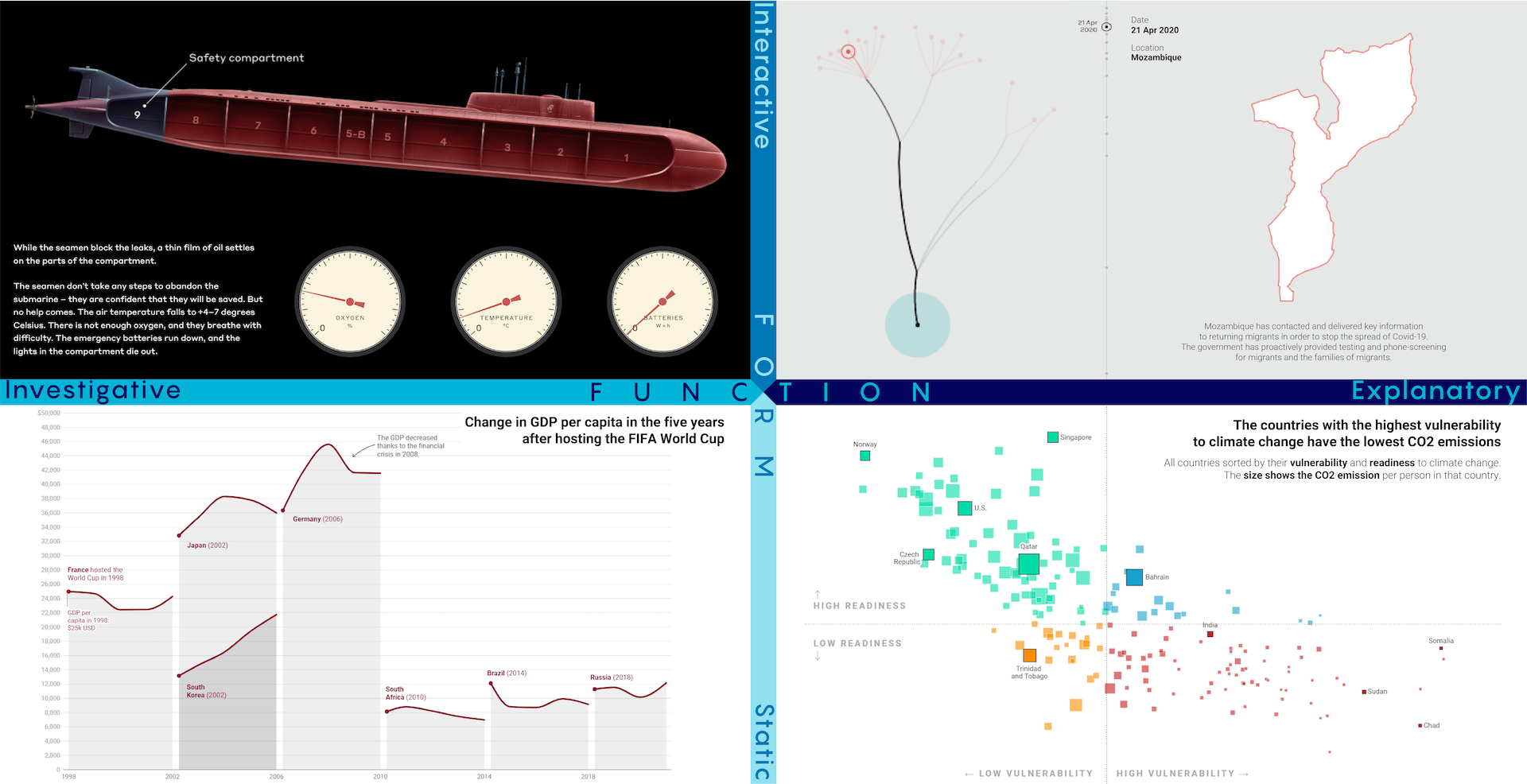
Figure depicting form and function along the x and y axes.
The double spectra of Form and Function
When we explore the Form, static visualizations provide all the information at once and do not move. These are, for example, your basic line, bar, and pie charts. Interactive visualizations allow a transfer of information between the user and the interface. As the user clicks, swipes, or hovers, additional information appears.
Regarding the Function of the visualization, graphics run from investigative to explanatory. Investigative visualizations encourage the user to explore the data or subject matter to uncover findings for themselves. Explanatory visualizations bring the results to the forefront; they convey the author's hypothesis or argument to the reader.
- Static investigative visualizations display data with no possibility for interactions. Here, readers interpret data, results, and conclusions with a static image. For instance, John McGall’s “Is the FIFA World Cup good or bad for the host nation’s economy?” contains impressive static infographics.
- Static explanatory visualizations typically illustrate an argument from the text or presentation. They tend to be line or bar charts, such as this graph by David Wendler, “In the climate crisis, vulnerable countries bear the least responsibility.”
- Interactive investigative visualizations display a complete data set and prompt readers to find interesting patterns or stories. A great example is Why did the Kursk Sink? by Storyworks.
- Interactive explanatory visualizations allow a reader to experience a story dynamically because they are interactive. In their visual, “Key workers: Migrants’ contribution to the COVID-19 response”, ODI illustrates a magnificent example since it visualizes specific blocks of data that are pieces of a larger story.
Final words
When you start designing the type, format, and display of data for your visual, knowing about the interaction of these two axes becomes a crucial step to effectively communicating information to your audiences. You must be aware of the pros and cons of each type of visual to serve the readers of your content best.
The scheme presented here will help you highlight the aspects of your data and narrative necessary to convey a message effectively and meaningfully. You must consciously serve your audience with the best visual storytelling tools, always considering their backgrounds, informational needs, and expectations. Data never communicates by itself. It must be questioned and compelled to speak. You now have all the elements to start conceptualizing data-driven stories and bringing them to light. Enjoy visualizing your ideas!