
The bar graph is one of the most widely used forms of data visualization in science. This is not a bad thing as the venerable old bar graph is a comfortable, easy way to accurately represent specific quantities with varying bar lengths. This representation also allows for easy comparison between measurements by comparing the bars.
The challenge comes when the benefits of this accurate and easy tool are pushed too far. As we’ll see below, if the number of datapoints and comparisons in a bar graph becomes too great, the cognitive burden on the reader can become overwhelming.
Increasing the Cognitive Burden
To help illustrate this, I’ve generated some example datasets. We will start with a simple dataset involving the measurement of two variables at two different times. This could involve the measurement of two different metabolites on groups of subjects before and after a treatment or perhaps the measurement of two different environmental features at two different times of the year.
Figure 1A shows a simple bar graph where we are comparing the two measurements at two times. As mentioned above, the purpose of a bar graph is to help people make comparisons in data. With this small number of bars we can make a few very quick observations. For example, we can see that the dark blue bars are higher than the light blue bars at both times and that the dark blue bar at time two is higher than any of the others.
In this graph there are actually 6 different comparisons that can be made. The arc diagram in Figure 1B helps clarify the number of possible comparisons in this plot.
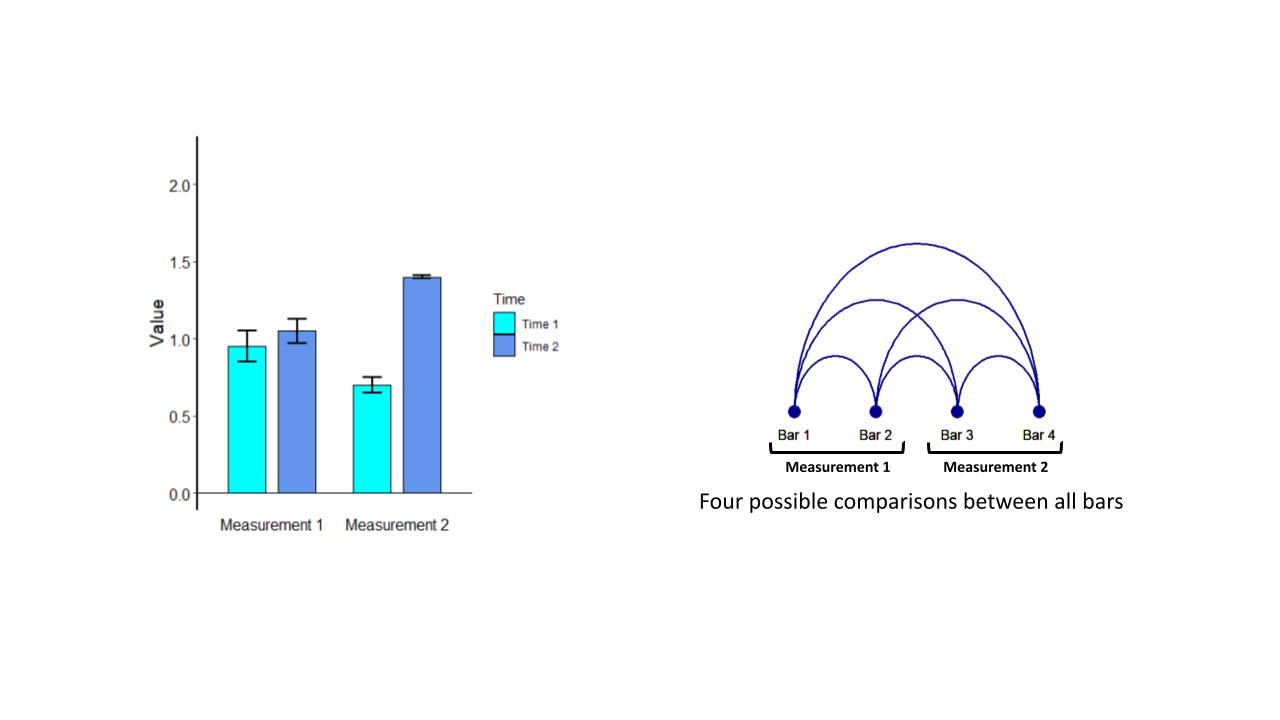
Figure 1A & 1B
Now, let’s consider a more detailed experiment where we still have only two measurements, but we are evaluating them at five timepoints. This is shown in Figure 2A.
From the bar graph, we can see that measurement 1 goes up steadily across time, while measurement 2 goes up and then down. With 10 bars in our graph, making specific comparisons is a much more complicated task. For example, comparing measurement 1 at time 3 with measurement 2 at time 4 requires a significant amount of focus.
The arc diagram in Figure 2B shows that the number of possible comparisons in this bar graph has increased to 45.
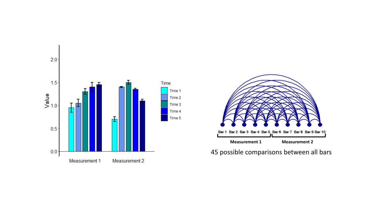
Figure 2A & 2B
Finally, let’s push this even farther and consider six separate measurements across the five timepoints as shown in Figure 3A. In this case we have 30 individual bars and it is quite easy to see that making individual comparisons in between bars has become a gargantuan task. Figure 3B shows that the number of possible comparisons in this dataset has now risen to 435!
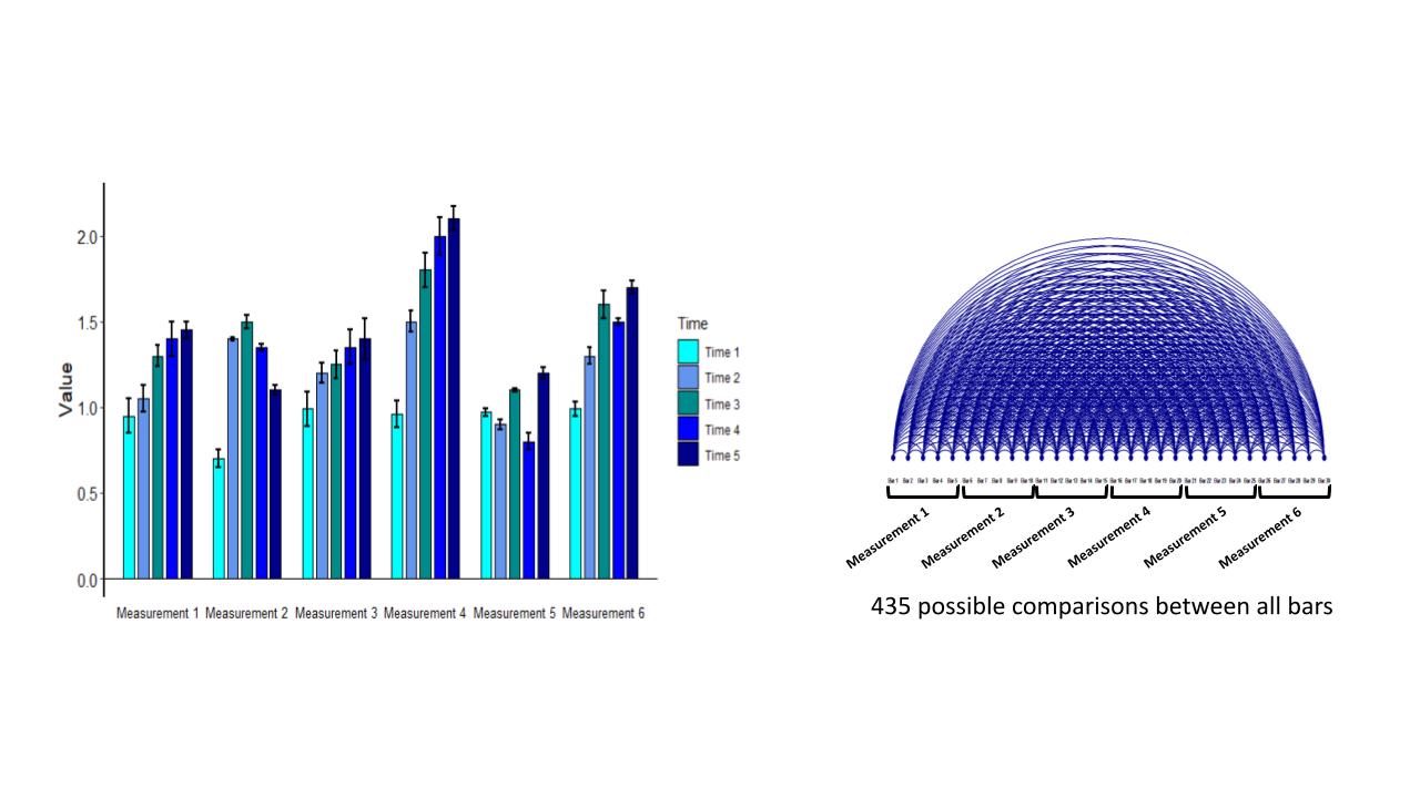
Figure 3A & 3B
Studies from the Franconeri Lab have shown that each of these comparisons can take hundreds of milliseconds to process so that only a few comparisons can be made per second. Furthermore, this task quickly overwhelms our working memory so that new numbers or comparisons will displace the ones we just considered. At this point the cognitive burden has reached such a level that many of the important features are lost in a mire of information.
Take Advantage of Data Structure
To help reduce the cognitive burden of these presentations, we can take advantage of the structure of this data. Measurements across time are naturally sequential and so it would make sense to connect the data across this series. This type of analysis is well represented by a line graph.
Figure 4A shows the line graph version of the data presented by the bar graph in Figure 1A. In this case the difference in the relative amounts of measurements 1 and 2 are quite clear.
Figure 4B shows the line graph version of the data shown in Figure 2A. In this case comparison of the two measurements over 5 timepoints is significantly easier to see in the line graph. We have essentially taken the 10 bars with 45 possible comparisons and reduced them to a comparison of two lines.
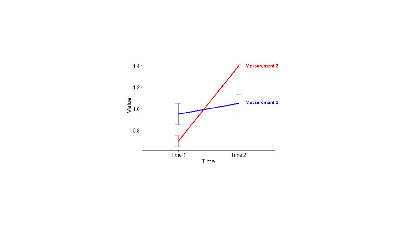
Figure 4A
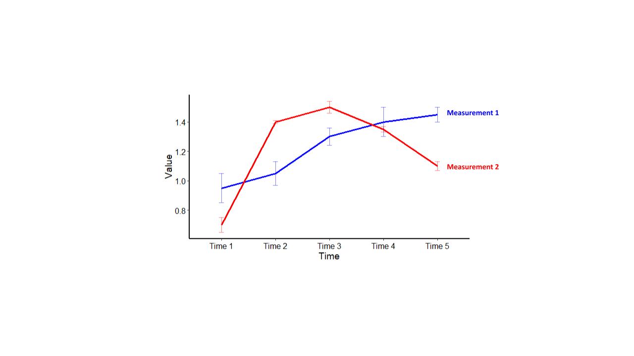
Figure 4B
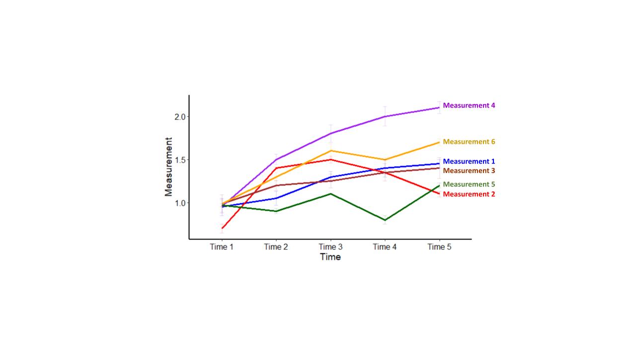
Figure 4C
Lastly, Figure 4C shows the line graph version of Figure 1C. In this case we have reduced the representation of the data from 30 individual bars and 435 pairwise comparisons to just 6 lines! An additional advantage is that each of the lines is directly annotated, removing the cognitive burden of having to look between the legend and the individual bars.
This example shows that taking advantage of a data set’s structure can open the door to a different type of visualization beyond the simple bar graph. In addition to clearly communicating the data, this type of data visualization is also quite useful for scientists during data analysis and interpretation. Trends that were difficult to extract from the bar graph become quite obvious in the line graph.
In future posts, I’ll present other ways in which more deliberate and judicious data visualization choices can benefit scientists while analyzing data and when communicating results to a large audience.