The Best Ways to Produce Effective and Appealing Data Visualizations
At some point in our lives, we all heard the adage, “An image is worth a thousand words.” Of course, visuals are extremely powerful across print and online media. Nevertheless, for those of us who are not professional graphic designers, our decisions about graphs, labels and annotations, colors and fonts, and other design choices are often subjective.
Regardless, our visuals must be tailored and constructed for our audience(s). Our ultimate goal must be to produce visualizations that engage and inspire our audiences to think, feel, or act with the information we share.
In his 2008 bestselling book Brain Rules, developmental molecular biologist John Medina states “The more visual the input becomes, the more likely it is to become recognized and recalled.” The more visual we can make our data and content, the more we can expect our readers to remember and hopefully use it.
More than a century of research and practice have distilled essential elements that will make your visualization engaging, vivid, and meaningful. A good understanding of these properties will change the way you can visually tell stories with data.
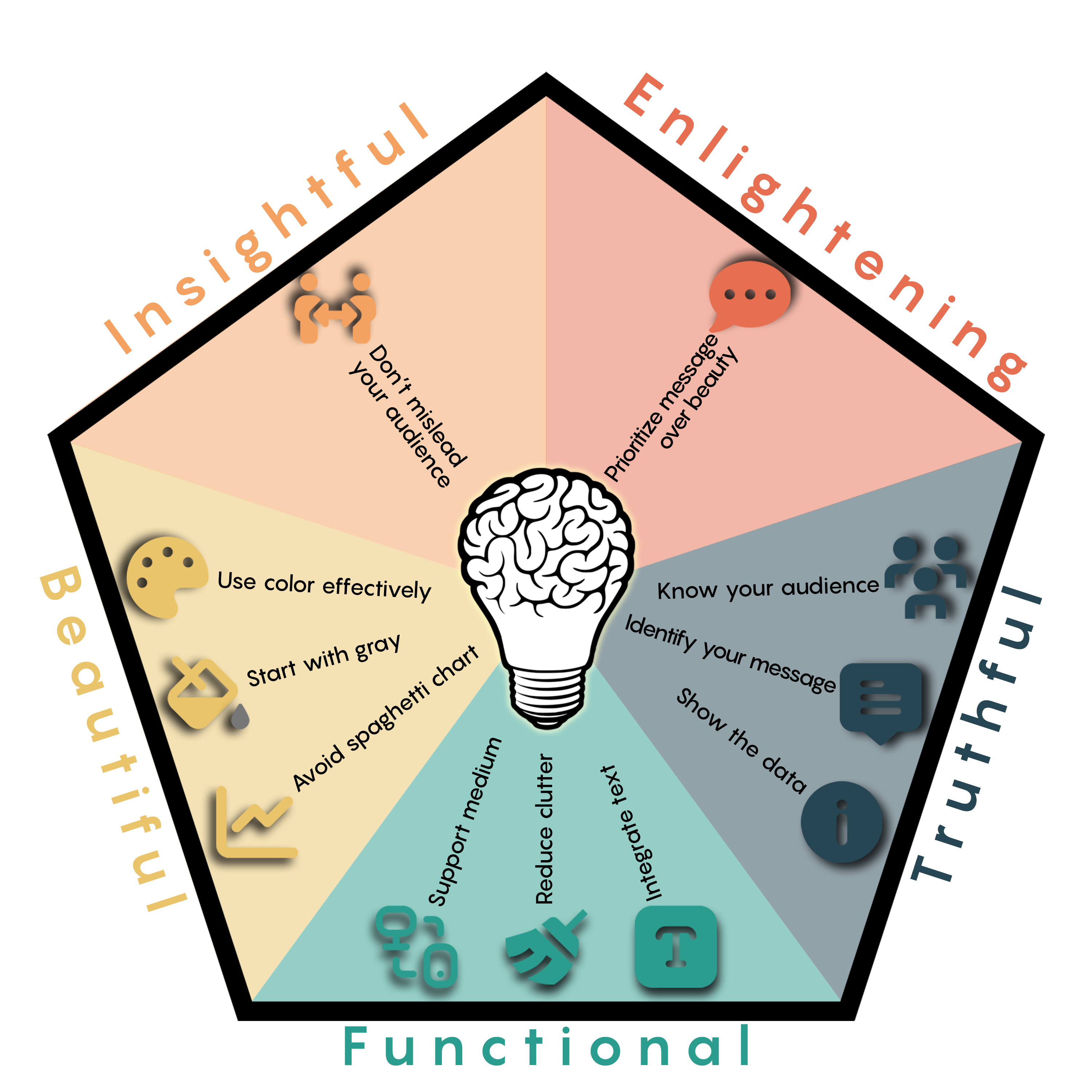
Figure 01: The five qualities of effective visual communication and their elements.
The five qualities of effective visual communication
1. Be truthful: Thorough, honest, and transparent research must be the foundation of your visualization. Present information concisely, clearly, and elegantly. A fantastic example is “Dashboard of the Present Future” by Lindsay Poulter (2023). Being honest involves two strategies. The first one is to avoid self-deception. Here, people do their best to create honest visuals by, in part, being aware of their biases and preconceptions. The second strategy is to be honest with your audience that we are showcasing reality as we understand it, not necessarily as absolute truth.
In order to accomplish this successfully, there are three major steps you must take.
Know your audience
Whom are you trying to reach? What might they already know about what you have to say? Why might they care, or not, about what you have to share?
Identify your message
What are you trying to share with your audience? You need to clearly establish your visual’s communication objectives.
Show the data
Your audience can only grasp your point, argument, or story if they see the data. You may not need to show all your data, but you should highlight the necessary values of your argument. As content creators, our challenge is deciding how much data to show and the best ways to do so. Sometimes, figuring out what to omit is just as tricky as figuring out what to keep.
2. Be functional: You must execute an accurate depiction of your data. Your perception of the targeted audience(s) should guide your decisions on how to shape and visually display your data so your audience can accurately interpret the information. You should treat the title and written portions of your visual as carefully as the graph itself. Gregor Aisch shows a clear example of this principle in his article “A look at some depressing data about school shootings in the U.S.”.
Adapt the visual to support the medium
Keep your medium in mind, as well as how long your audience will have to examine it and from what distance. For instance, a figure printed in a journal allows for prolonged engagement, so it can be detailed and information-dense. On the other hand, a figure on a slide will only be up for a brief time, and the audience may be seated far away from the screen; in these cases, keep things as simple as possible.
Reduce the clutter
Unnecessary visual elements distract your audience from the central data and clutter the visual field. Avoid the unnecessary or confusing visual elements that do not strengthen the message (in the best case) or add confusion (in the worst case). Simplifying the graph by discarding extraneous, distracting elements makes your argument clear and comprehensible.
Integrate graphics and text
Text and annotations can explain the content in the visual and how to read the graph itself. In essence, we can focus on three primary ways to integrate our graphs and visuals: removing legends, creating active titles, and adding detailed but relevant information. You can read more about this topic in this excellent article, “What to consider when using text in data visualizations” by Lisa Charlotte Muth.
Remove legends when possible and label data directly
Legends require the reader to remember labels and interpret the figure simultaneously, and such mental toggling can be taxing and impede understanding. You must be able to integrate the text and the data with the needs of your audience always in mind.
Write the title like a newspaper headline
“Active titles” or “headline titles” are condensed but simplified sentences that summarize the essential concepts of your composition. They help your audience understand the main takeaway concepts of your visual. Challenge yourself to keep text to the length of a tweet —280 characters or fewer— to help your audience stay focused on your core messages.
Add explainers
Sometimes data sets have peaks or valleys, outliers, or variations that bear explanation. Adding detail to graphs can push your argument, highlight points of interest, or (in cases of nonstandard visuals, such as the simulation at “A Day in the Life of Americans”) even explain how to read them. Annotations help audiences quickly grasp the content.
Captions are a must
Captions explain how to read the figure and provide information about what cannot be graphically represented. For instance, if numerical values are important, they must be presented clearly in the figure. Similarly, if there is a point of interest, it must be visually distinguishable or highlighted in the captions.
3. Be beautiful: You must strive to be aesthetically pleasing to your intended audience. As an example, Federica Fragapane follows many of the principles of beauty in “Representation of women in politics: An analysis of the gender gap in political representation”.
Use color effectively
Colormaps can be classified as sequential (one variation of a unique color, used for quantitative data varying from low to high); diverging (variation from one color to another, used to highlight deviation from a median value); or qualitative (rapid variation of colors, used mainly for discrete or categorical data). Choose according to your message and communication objective. Do not trust the defaults. The settings from any software are not fine-tuned for a specific type of plot.
Start with gray
When you make a graph, start with all-gray data elements. Doing so forces you to use color, labels, and other elements purposefully and strategically.
Avoid the spaghetti chart
You will quickly notice when a graph contains too much information (line charts that look like spaghetti, maps with dozens of colors and icons, or bar after bar after bar littering a chart).
Avoid the packed single chart by breaking it into smaller parts. Called grid or panel charts (also known as facets, trellis charts, or, most commonly, small multiples), these smaller charts use the same scale, axes, and scope but spread the data across multiple visuals. In other words, instead of putting all the data on one graph, create multiple smaller versions with variations on the basic data.
4. Be insightful: You must seek to reveal evidence that would be hard to see otherwise. Every visualization aims to share data and promote discoveries. For example, the angle taken by Simon Jockers in “Is the Rhine drying up?” illustrates the data behind the impact of the low water levels of the Rhine river in several countries in Western Europe.
Do not mislead your audience
A data-driven visual is, by definition, tied to the data. If you loosen this tie, you may unintentionally convey a different message than intended.
5. Be enlightening: With your work, you may aspire to improve your audience’s understanding through data. Great visualizations give people access to information and increase their understanding and well-being. For instance, Veronika Halamková, in “Women and hidden violence”, depicts the multiple (often invisible) aspects regarding violence against women around the globe.
Prioritize your message over beauty
In science, your message and the readability of the visual are the most important aspects, while beauty is only an option.
Final words
Anybody can vividly communicate their research if visuals are designed with a specific audience in mind, always considering their needs, biases, and preconceptions. All the advice provided here will help you to navigate your data and design appealing visuals. There are plenty of software options to help you build visualizations. Take the time to explore them until you find the one(s) that work best for you. Once you find a few you like, keep using them —you will be amazed at how your skills grow!
All communicators can do better. We have the potential, the theoretical background, the methodologies, and an entire arsenal of tools to visualize substantial scientific discoveries. Let’s start a revolution together!