Visualize and Measure Your Science Communication Using These Tools
According to some estimates, the brain processes visual content 60,000 times faster than text (Pant 2015). In the era of social media, that’s a huge opportunity for science communicators. We often only have a few seconds to capture the public’s attention.
From Dr. Annettee S. Lee’s use of visual art to bridge science and culture to Carl Sagan’s TV series “Cosmos,” many noteworthy science communicators use visualizations to promote science and educate the public. A visualization is a method of communication using images, infographics, or videos. It’s also an essential tool to help bridge the gap between researchers and the public (Dunlap and Lowenthal 2016).
Science communication research offers some basic guidelines for creating effective visualizations. Learn more about the online tools that can help, without compromising the factuality of your science.

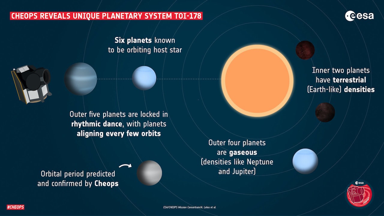
Instead of just sharing an article about their discovery of the TOI-178 planetary system, the European Space Agency created an engaging infographic (source).
Understanding your audience
People care about messages that are relevant to them. Individuals view science through the lens of their own values (National Academies Press 2017). Make your visualization personal. Uncover your audience’s values and integrate it into the message.
Answer the Public tracks search phrases so you can see what interests people about your science. For example, searching for “wastewater” reveals that users often search for “kitchen wastewater.” Use this tool as a starting point to make your science more relevant to the audience.
Developing messages
When you understand what's relevant to your audience, start creating messages. Your main message should be simple and concise. Convoluted messages quickly erode the public’s trust, especially when they can’t understand it (Weingart, 2016). Hemingway is a free tool that offers suggestions to improve your writing's clarity.
Also, identify facts that support your message. Factual and consistent messages are especially important in science communication. Your audience will quickly lose trust in you if you confuse them with conflicting or changing messages.
Creating visualizations
With messages in-hand, it’s time to start building our visualizations. Canva is a free online tool for creating visual graphics for social media. Tableau is a data visualization tool that you can use to make charts and graphs more engaging.
Consider three elements when creating a visualization: Information, color, and format.
Limit your use of text, data, and other detailed information in the visual. Remember: It takes our brains longer to process images with more text (Houts et al. 2006). Additionally, avoid using too many graphics or illustrations that don’t add anything. When in doubt, keep it simple! Simple visuals are more likely to stop users as they scroll through their social feeds.
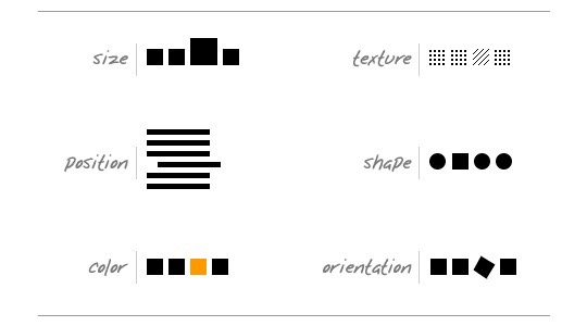
When creating visualizations, use contrasting elements to help the audience distinguish between information. Different types of contrast include size, position, color, texture, shape, and orientation. For example, you may use colors to create relationships or invoke emotions. Red can excite people, while blue is often more calming. Science communication research in Nature (Crameri, 2020) offers more guidance on responsibly using color in visualizations.
Always ask yourself if the format you’re using to communicate your data is the most effective. If a pie chart has more than seven slices, a table would be better. Often, icons can represent simple text in a visualization.
Read more about visualizing your data here.

Different types of contrast include size, position, color, texture, shape, and orientation (source).
Measuring success
One of the best ways to uncover what works best with your audience is through testing and learning. Start with a control communication, then develop a different version by adding in a new type of image or format. Then, publish the two different versions and track the results. For example, if you’re communicating on social media, create one post with a video and another with just a video. Observe which post generates more likes, comments, shares, and views.
Using these results, compare the two versions to determine if the tweak was successful. If you see increased engagement with the new versions, implement those changes. If not, start with some fresh ideas and continue to evolve your science communication. Marketing professionals call this A/B testing.
Familiarize yourself with common terms used in social media measurement. For example, “reach” is the number of times a social media post has appeared in users’ feeds. “Engagement” measures how many users interact with a communication, as a percentage of the reach.
Keep in mind that different social channels, including Twitter and Facebook, have different ways of measuring data. Google Analytics is the best way to track and measure website performance.
These tools and guidance can help almost any scientist create original visualizations. However, this is just the beginning of your visualization journey. Continue to learn about your audience and discover what works best with them. Follow science communicators and artists online for inspiration.
